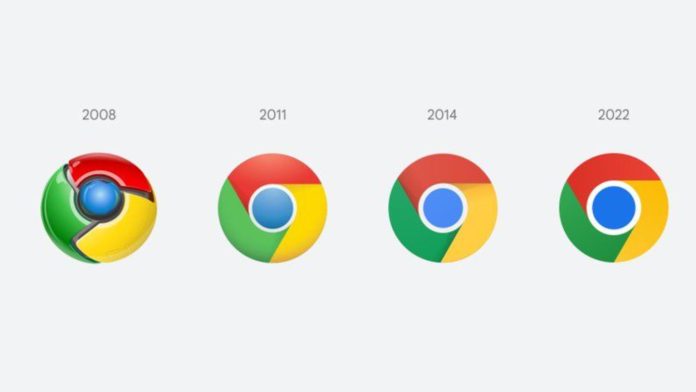
Google Chrome 100 appeared on a stable channel yesterday and brings many improvements in the handling of cookies and more tabs, as well as in the purchase of digital goods through web applications in the Play Store. However, a relatively small change that is not mentioned in the release notes is that it has a new logo.
The change of logo was first announced by Google designer @elvin_not_11 on Twitter back in February. As you can see below, the design changes are subtle and primarily include removing shadows and lighting colors.

This is the first modification of the Chrome logo design since 2014. As can be seen in the picture above, since 2011, Chrome has gravitated more towards a flatter design, and removing shadows in the 2022 logo only emphasizes this approach.
Elvin went into further detail about updating the logo, saying the design is actually a little different on each platform to fit in with both the theme and the language of the OS design:
We also found that placing certain shades of green and red next to each other creates an unpleasant color vibration, so we introduced a very subtle gradient to the main icon to soften it, making the icon more accessible.
Then we made OS-specific adjustments. We want the icons to look recognizable in Chrome, but also well-crafted for every OS. For example, in Windows, icons take on an apparently staggered appearance, appearing at home on Windows 10 and 11.
ChromeOS uses lighter, tint-free colors to match the look of other system icons. For macOS, they look 3D.
The updated Chrome logo should be available to everyone after updating to version 100. It probably won’t affect your browsing habits, but it aligns the graphics with Google’s current design principles.
READ MORE:
- Apple is already reducing production of the iPhone SE
- How to restore the display of dislikes on YouTube?
- What is the best-selling phone in 2021?


